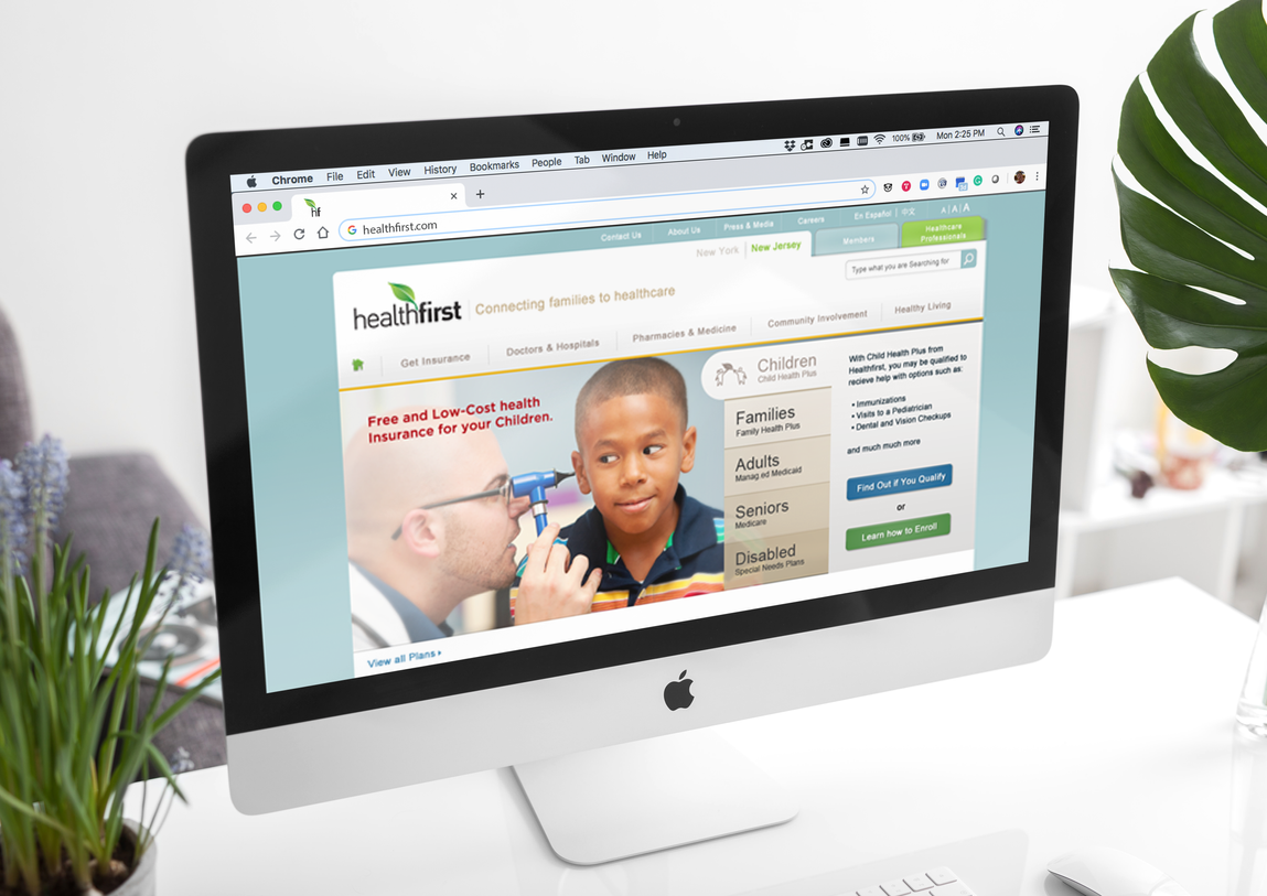
FEATURED WORK
HealthFirst:
Refreshing a Healthcare Brand
Scope:
Brand Development
Brand Identity
Collateral and Promotional Design
Background:
At a time when healthcare is so top of mind for everyday Americans, and with increased competition as well as government intervention, this NYC community-based healthcare benefits organization knew it was time to evolve. The goal was to present a more contemporary persona that didn’t alienate current customers and stakeholders but communicated HealthFirst as a clear and credible player in
the market.
Challenge:
Retaining and growing market share is always the challenge for any organization. In HealthFirst’s case, they also needed to regain trust. In recent years that trust had waned and the organization wanted and needed to do something about it.
Favorite Detail:
We love the clever way the monogram is seamlessly exited out of the full word mark to create a useful graphic shourthand for the organization.
Approach:
The mantra, “do no harm” doesn’t only apply to medicine. In developing and refreshing brands, it is our guiding principle. Our approach was driven to retain but modernize the ‘leaf’ symbol. Then, develop a flexible presentation system of the identity. Next, we developed a prioritized touchpoint strategy that concentrated budget and effort on the most effective
touch points. This ensured the brand program would have
the smartest impact in the community. That strategy included revitalizing the brand identity system, and planning and producing materials for a roving street signup campaign.
This included a proposed ad campaign, all targeted for the streets of NYC.


